SEO and UX – A Perfect Team to Bring Value & Achieve your Business Goals!
By | Date posted: | Last updated: March 22, 2021
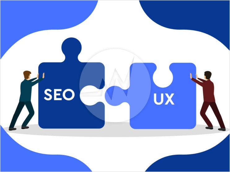
seo and ux

No matter how someone finds and consumes your website or its content – users have certain expectations when they interact with your website. The demands, expectations and needs of the users should not only be satisfied, but ideally also be exceeded. Positive associations should be awakened in the user! For this reason, it is important for every company to adapt to the current situation. The user must be on the entire customer journey, from the information search to the conversion, are accompanied and enjoy an optimal experience when interacting with your company. Search engines have been adapting to changing user behaviour for years and are now in a very good position to interpret the user’s intentions and to deliver tailor-made search results.

Combine user experience and search engine optimization for more conversions

With the help of the combination of the two disciplines SEO and UX, you ensure that, on the one hand, qualified visitors become aware of your website and, on the other hand, more conversions and sales can be generated. If you only concentrate on one of the two disciplines, this leads to suboptimal experiences, either when searching or when using your website. This leads to fewer conversions, lower user satisfaction, fewer customers and thus less sales.

In this blog, we will look at all important aspects of the combination of SEO and UX. In this way, you will find out what the two disciplines are all about and how they should be combined with one another in order to make a significant contribution to the growth of your company. SEO and UX these both terms are interconnected and one should follow some website design tips to increase user engagement. Following those tips will be of great help to you in achieving further goals for SEO KPIs.

How UX affect SEO?

The user experience (UX) is now a decisive influencing factor for search engine optimization and includes the user experience or the entire customer journey. In other words, all the effects that arise for the user with the use of a user interface before, during and after use.

Elements of UX

A good user experience starts even before you actually visit the website. The following points show where exactly the interfaces to SEO are:

  • Relevance

    A good user experience starts in the SERP (Search Engine Result Page). The snippet should clarify what the website is about and match the search intention. No false expectations should be aroused! This would only lead to the visitor arriving at the website and leaving it disappointed. That would be a bad user signal and affect SEO.

  • Trust

    Would you go shopping in a shop that looked dubious? No? – We neither! The same applies in the online area. A website must appear trustworthy so that the visitor can shop in a relaxed manner. We don’t want to take any risks when making important decisions. Trust elements, seals of approval, social proof signals and a professional design are suitable for building trust.

  • Orientation

    Users have a low tolerance for barriers. It must therefore be immediately clear what the respective website is about and where further information can be found. If visitors have problems with the user guidance and feel overwhelmed with the selection, the probability of a jump increases. A clear structure is therefore of essential importance.

    A few tips for a clear orientation:

    • Structure content
    • Focus on the relevant content with added value for the user
    • Content according to the proximity rule
    • how users where they are (breadcrumb)
  • Stimulation

    Arouse emotions with your content! Because without stimulation, no action is triggered in the user. It is therefore fundamentally important to know your own target group. This is the only way to address users emotionally.

  • Comfort

    Don’t put obstacles in the way of your users! Make the structures and processes on your website as simple as possible. It is important to avoid frustration in any case. Use well-known patterns and learned action, because this makes it easier for the user to orientate himself.

The common goals of UX and SEO

No matter what industry your company is in, you depend on your website to build trust, offer services, answer questions from potential customers and sell products. So, you need a holistic online presence to generate qualified traffic and increase conversions on your website.

Your customers have specific problems and run searches to find answers. Accordingly, the expectations of the content and the use of the website after the first search results in the SERPs are very high.

If you have followed the topic of SEO in recent years, you know that the optimizations are specifically aimed at offering the searcher the best possible experience when using search engines and the respective website. The focus here is on the user. For this reason, the search intention should be met and the best possible user experience should be sought.

Build customer journey with great user experience

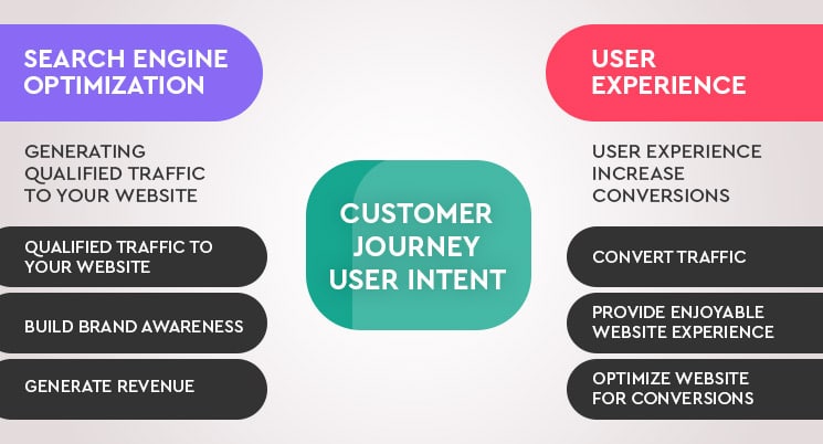
SEO focuses on directing searchers to the content of a website through various optimization options. Simply put, the first goal is to drive traffic to the website. However, this is only half the battle. UX primarily focuses on reaching users as soon as they reach a certain website (e.g. via organic search). Essential goals are to ensure the best possible website experience and to turn users into customers.
ux and seo

However, the organic traffic is worthless if it is not qualified. At the same time, a positive user experience on your website is worthless if you don’t have visitors to convert into customers. So, on the one hand you have to maximize the visibility in search engines in order to attract as many qualified visitors as possible to your website and on the other hand you have to continuously optimize your website in order to turn as many users into customers as possible.

Why SEO and UX aren’t mutually exclusive?

In the past, UX designers and SEOs have often competed. Many companies have allocated their marketing budgets for both disciplines separately, which in turn gave the impression that one had to “compete” for the budgets.

In the meantime, however, online marketing is much more focused on the user. As a result, companies have found that the disciplines of online marketing, such as SEO and UX, have to be viewed holistically in order to reach target groups, survive in the market and ultimately generate more sales and growth.

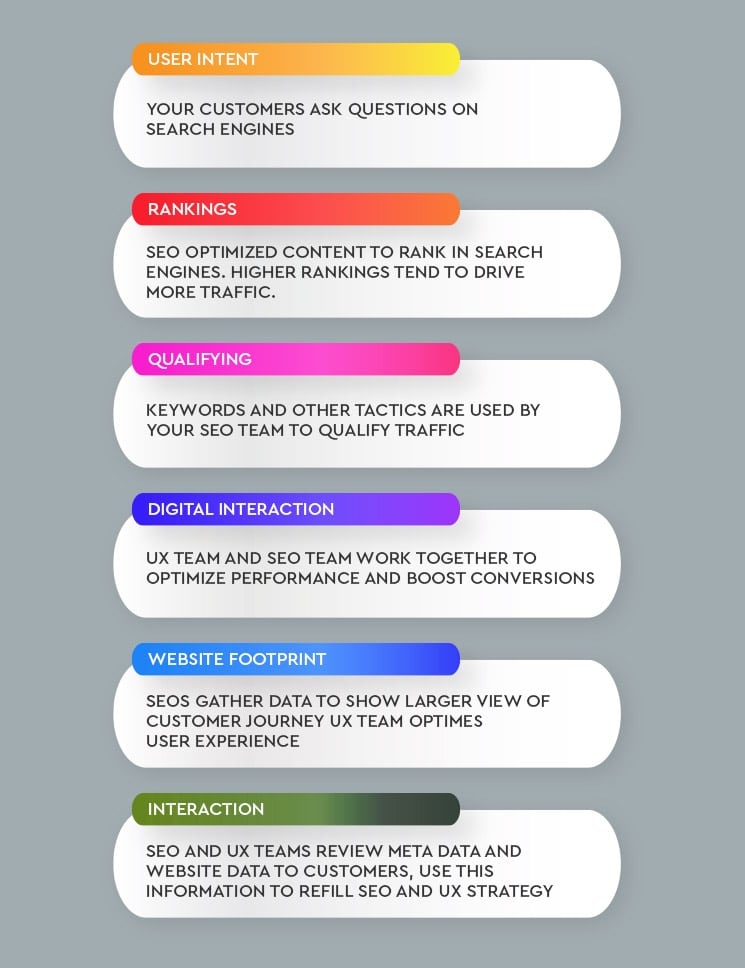
As a promising alternative to the idea of competition, both areas should work together to offer a great user experience when using the website. The optimizations and measures of the respective disciplines only start in different phases of the customer journey: While SEOs bring the user to the website through the best possible search experience in the course of the search query, the UX team then starts to refer the user to a customer do.

As search engine algorithms continue to evolve based on user experience and user intention, marketers should learn to look at both disciplines together in order to generate qualified traffic and increase leads and conversions on the website.

How SEO and UX influence each other?

While users are always better informed through the many different sources of information, they receive more and more suitable offers and results in the course of their search query in order to solve their problems and questions and to satisfy their needs in the best possible way.

As a company, you have to stand out from the competition and position your website excellently on the Internet. You have to succeed in making your content, values and mission visible to users in every phase of the customer journey. The knowledge and usage data of both disciplines must be linked in order to be able to draw the right decisions for the best possible experience when using the website for the user. However, this process only works if SEO and UX teams work together and share their results, data and knowledge.
seo and user experience

How SEO affects user experience?

A typical SEO does not have to be a full-fledged UX expert. But every SEO should know and be able to apply the basics of UX design. All processes and activities must take the user into account and offer added value. Of course, SEOs specifically take into account aspects that are important for search engines. Often, however, these are still aimed at the user, since search engines have learned what users are looking for and need.

Search engines use algorithms to identify patterns that people are looking for. They collect data that help them to understand user behaviour as best as possible. The algorithms are optimized from this data in order to better satisfy searchers and offer fewer results that are not aimed at the needs of the user.

This means that websites that address the search queries better have a better chance of landing on the first page of results with their content. For the ranking, Google uses over 200 ranking factors, which determine the final placement of your website in the course of the user’s individual search query.

If Google see that someone returns to the search results after calling up the website, then this is an indication that the user was not satisfied with the result. The search engine only sees the bounce and states that something is wrong with the website. The job of SEOs is to find out what caused this behaviour and then ultimately find ways to provide the user with a better result. UX experts can provide support with their findings.

This data can be used to make more informed decisions about how to optimize the website. After all, it is easier to make adjustments when you know what users are looking for and what needs and questions exist and need to be met. These adjustments and optimization potential can help to increase conversions and sales for the company.

Why is UX essential for search engine optimization?

SEO data is great for identifying general user trends. However, this information cannot identify specific problems on the website itself that affect how users interact with the content of a webpage. An optimized website experience means that users spend more time on the website and ideally are also recurring. In addition, the goal of a conversion is sought. The added value of a good UX is still underestimated and neglected. However, a great user experience is crucial for the user experience on the website. User experience not only influences how individuals perceive a website, but can also have a positive impact on how search engines rate the authority, relevance and satisfaction of user intention on your website. This in turn affects your rankings.

Happy users and customers

An appealing design and intuitive user guidance improve the entire user experience of the website, which at the same time ensures improved user and ranking signals. The design of the layout and the arrangement of the information with regard to the search intention and the goals of the user has a direct influence on the user experience in the course of the search query and during the interaction with the website content.

How can Google determine user experience?

Google and other search engines know where, how and when users consume content. Various methods are used to determine, based on data, how the respective website is perceived. Search engines consider elements such as loading speed, mobile user-friendliness, the structure of the content as well as internal and external links to the websites.

In addition, Google uses user signals to find out how users perceive the quality of your website. User signals are patterns of behaviour that Google sees on your website. These include, for example:

  • Returning users
  • Bounce rate
  • Scroll depth
  • Dwell time (time on site)
  • traffic
  • Number of pages viewed
  • Social signals
  • Click-through rate

The influence of the user signals (user signals) on SEO is shown by the fact that the user signals rated positively by Google contribute directly to a better ranking in the SERPs. Consequently, a positive development leads to added value for everyone involved. Continuous observation and optimization of these key figures therefore plays an important role.

Why “Responsive Design” is so important?

The importance of a good interaction of both disciplines in the course of optimization is increasingly evident in the behaviour and expectations of users. The increasing expectations, multiscreen and the increasing importance of mobile devices mean that the responsive design of a website should now be seen as a basic requirement. This involves the dynamic adaptation of the content and efficient use of the display area of the terminal device currently in use.

Google has already taken this point and the consideration of a responsive design with the switch to the Mobile Index and the published Mobile-Friendly-Update into account several times. When optimizing a website, mobile user-friendliness therefore plays a role that can never be neglected in the course of responsive design for all devices. A website that is not yet fully optimized for mobile devices offers a poor user experience and has a high probability of not meeting user expectations and requirements.

In addition, Google has now switched to the Mobile First Index and defined it as the new main index. In addition to the mobile version of a website, it is now checked whether there is also a suitable desktop version. Website operators who continue to ignore this aspect will have to rethink and make adjustments at short notice.

Language of the seeker

The search inputs of the users provide a valuable impression of how the target group searches and thinks about products and services. Far too often we see companies that speak the language of the industry. However, users looking for products and services often enter completely different words in search engines because they are seldom familiar with the terms used in the industry. Keyword research not only reveals the words and phrases that your target group is entering, but also lets you determine which problems your target group is facing and which solutions are being sought.

High-click snippets

Search engine optimization isn’t just about building rankings. It is more about attracting as many qualified visitors as possible to your website. Better rankings ensure a higher placement on the SERP and thus higher click rates and more visitors. In addition, there are more options for more users and higher click rates. It’s entirely possible to get more clicks than a better positioned competitor. If you manage to get more attention than other search results through your entry in the SERPs, you will also get more visitors. Speak a language that encourages the searcher to click on your result.

Title tags

The title tag is the heading of the search result and is limited to approx. 70 characters. Write a short and concise text that includes the important keyword inputs and, if necessary, further information or a call-to-action (CTA). The user must become aware of your entry while scanning the results and be encouraged to click.

URL / breadcrumb

The URL or breadcrumb of the page follows in the search result below the title tag. Here you should also make sure that the respective main keyword of the page is placed so that the user can directly see what content user can expect on your page. If the name of the URL deviates from the user’s intention, the user will presumably not click on your result entry.

Meta description

The meta description represents the description of the search result. This follows the URL in the search engine result entry. Here you could briefly describe what content the user can expect on the page, currently about 160 characters. Provide as valuable information as possible here that animate the user to click and place a specific call-to-action.

Content & structure

Content quality

The quality of your content is one of the most important factors for good search engine rankings and a good experience using your website. If you offer irrelevant or inferior content, it usually leads to a poor user experience and bad user signals.

Navigation

A website’s navigation is a UX element that is also very essential for search engine optimization. In order to avoid crashes, users have to find all relevant content quickly and intuitively.

Loading time

The topic of loading times is now a central aspect when optimizing your website. Google defines the core web vitals as the central benchmarks. These move the user experience even more into the foreground and consist of the following key figures that are important for UX & SEO:

  • Largest Contentful Paint (LCP)
  • First input delay (FID)
  • Cumulative Layout Shift (CLS)

This topic offers great potential for many companies in the course of optimization and is extremely relevant for both disciplines.

Headlines

Headings are a relevant factor in search engine optimization. But how do they influence the user experience? They improve the legibility of pages; help structure the content and are intended to encourage the reader to read the following paragraph. Users can scan the content via headings more easily and get a rough overview without having to read the entire content in advance.

Image tags

An often overlooked UX problem on websites. By adding tags to images, you optimize the usability of your website. You use it to provide information if the images cannot be loaded. From an SEO perspective, you can also use images to improve the quality of your content and generate additional users using the image search.

Also make sure to optimize the following aspects, for which you will receive helpful information in our Knowledge area:

  • Meta title
  • Meta description
  • URL presentation and breadcrumb

Avoid typical mistakes

Poor SEO often leads to poor UX – and vice versa. When looking at websites, you will often find the same, typical errors that were made in the course of an optimization. The result is a negative influence on both disciplines. In addition, an unexpected development of the key figures under the previously defined goals can often be attributed to these errors.

Optimizations always take place with separate consideration of the two disciplines SEO and UX. This lead, for example, to the fact that the website is viewed as a whole with regard to its user experience, but ignores the individual entry of a user in the course of different search queries. Confusing navigation and incorrect user expectations can be the result and ultimately lead to the visit being cancelled.

The well-known relevance of cross-device optimizations from the point of view of search engines and users should show that individual consideration and tracking are not a target-oriented method. But also make sure to gather your own experience and test it regularly and carry out competition analyses. Just because a certain measure works in one industry doesn’t necessarily work in another.

5 helpful Search Experience Optimization tips:

In order to avoid these typical mistakes, we would like to give you 5 tips to take with you as part of your website optimization:

  • Always cultivate the search experience idea – Because both disciplines are only half as successful on their own
  • Put on user glasses – what does your target group really want?
  • Uniqueness & Quality – Offer users high quality website content with added value
  • Meet expectations – Pick up users on their respective customer journey
  • Cross-device optimization – Right from the start & at all times.

Conclusion: Use SEO and UX to grow your business

Search engine optimization and user experience go hand in hand in order to offer search engines and users the best possible experience when visiting your website. The changed behaviour and the requirements of the users as well as the relevance and ranking evaluations of the search engines based on numerous updates of the algorithms show an increased merging of the discipline’s SEO and UX. As a result, search experience optimization is being used more and more. The focus is directly on the user, which means that the user experience should be considered at every point in the customer journey and in the course of website optimization.

We integrate UX strategies into our SEO and marketing processes. Do you need any help to improve your website usability or user experience? We are here to help you out! If you are looking for UX/UI web design, online store design, ecommerce website design, Please explore our website design services! We also provide website redesign service, website revamp service, online store redesign service or ecommerce website redesign service, for more information, please explore our website redesign services! Ultimately, UX helps to improve conversion rate. If you require help with search engine optimization, digital marketing, social media marketing, content marketing, explore our SEO Services!

If you have any questions or would like to know more about how Skynet Technologies can help your business to reach one step ahead, Reach out us through below form & We'll get back to you soon!

On-Page SEO for Ecommerce Store!

By | Date posted: | Last updated: December 29, 2020

Now-a-days, it becomes a necessary to rank your store higher than your competitors on Google. But, if you don’t implement On-Page SEO yet, then you are surely missing out the sales and rankings! Whether you have just started the online website or improving an existing online store, this ultimate guide provides the descriptive tips and tricks for growing your online store’s SEO.

Do you want to get higher google rankings for your ecommerce store? Read out this Step-by-Step guide to get your online store at top of the search engine and achieve more sales.

Category page optimization

Your category pages may be even more important than your product pages because these are the main entry points for customers. In addition, they offer customers the ability to choose and compare, much like internal search results pages. Your store’s category page should be considered a regular page for SEO, but it’s much more important when it comes to ecommerce usability.

Just few aspects to take into consideration:

  • Make sure the page has good value content, preferably at the top of the page.
  • Even if they scroll directly to the product listings, they will appreciate the extra information (and Google certainly does).
  • List all other categories as well, or at least make them accessible via a drop-down menu, especially when you have a lot of categories.
  • It makes more sense to make them available than to list them all. But if your store only has ten categories, list them, for example in a sidebar or footer menu.
  • Product listings require a proper call to action, so don’t hide – just add a button.
  • In the listing, the product image can help convince the visitor to click, purchase or compare an item.
  • Use stunning, good quality images that show the product well.
  • Optimize the product title, in addition to having SEO benefits, people looking for specific products, like that particular go set they’re looking for, will thank you for it.
  • Indicates if a product is available, nothing is more disappointing than finally finding the product you want and finding out it’s out of stock when you get to your cart. Instead, add a warning to the category page list.

Landing page optimization

A landing page is a page where your visitors end up when they follow a link from outside the site, such as search engines or social media. The landing pages of your ecommerce store should be optimized to elicit a particular reaction from the visitor, such as buying a specific product.

Focus on a product or package of products and optimize that page to guide your visitor to purchase – in other words, welcome. Make sure the visitor feels safe paying you by setting up an HTTPS protocol on your site and perhaps adding trust signals. Add social proof such as testimonials so your visitor will understand why your product is so good and why they need it.

We highly recommend using headlines and images to get your message across, they help a lot, especially for shoppers who “scan” (rather than read) your landing page. Make sure they get the right message to your visitors.

Product page optimization

In general, make your product page as usable as possible. Product pages need to be optimized for SEO, for example using data from Schema.org.

If your store runs on WooCommerce, implementing WooCommerce SEO plugin helps you with many of these things. But when your visitor lands on that page, you have to convince user to buy.

SEO Best practices

Let’s look at some best practices for product pages:

  • Create scarcity:

    If you only have a limited number of products available, this will encourage visitors to buy. But be honest about the numbers.

  • Add ratings and reviews

    Social data assists in comparisons and builds trust. Or not in stock. Be clear on this, as it will help manage the expectations of visitors.

  • Add to cart and add to wish list

    People may not want to buy right away for budget or other reasons.

  • Multiple product images

    Compensate for the fact that the customer cannot pick up the product and look at it from all angles by adding more than one image.

  • Offer product packages

    Buy this and that, as these products go well together. You could offer a discount for that package as a sales promotion.

  • Free Shipping

    For orders over of a certain amount. This is a nice gesture and just another reason to buy from you.

  • Related items

    People who purchased this item also bought that item, etc. They could spend more if you show them more items. Show people who use the product (as part of your product images). People will find it easier to relate and understand why they need your product.

  • Call to Action

    Just like your home page, your product page needs a strong call to action. Limit all distractions, make the text usable and use the right color.

Payment page optimization

Cart abandonment

There are many reasons why people might leave your website without purchasing anything. They might even put the products in the cart, only to abandon it. For mobile carts, there are even more reasons, such as loading speed or poor design. Investigating this will improve your ecommerce store and increase your sales.

You’re about to close the deal

The customer wants to buy your product, so let’s gently guide them to our checkout page. The first thing we need to do is tell them where we are in the checkout process, so be sure to add a progress bar. There are a few of items that are needed:

  • The image of the product:

    Even a small one, will confirm to the future customer that the right product is in the cart.

  • Prices

    Not just the price of an item, but also the number of items and the total price.

  • Additional costs

    Such as shipping costs. After cart overview there should be no extra cost of surprise.

  • Payment options

    Just to let the customer know how he can pay.

  • Security signs

    Like the SSL sites green lock and address bar, plus probably extra logos like Trustpilot right below the cart overview.

Guest purchase

You should also make sure that a guest purchase is possible. Having to sign up for a one-time sale is business.

Short forms

If you need to ask for more than just an email address, be sure to make the form as short as possible. Think of useful things like a checkbox to confirm that the delivery address and the billing address are the same, instead of asking customers to enter their details twice.

Payment

Simplify your payment by choosing a reputable payment service provider and offering convenient payment options. These will vary depending on the store and its customer base. After this optimized shopping process, the happy customer will leave your ecommerce store without fear.

Optimize site speed

Finally, you shouldn’t underestimate the importance of site speed when it comes to ecommerce usability. Today, every customer expects sites to load quickly. There is no point in waiting too long for a site to load while competitors’ sites load in a couple of seconds. Seconds really matter. Google considered site speed a key ranking factor.

If your existing ecommerce store is missing out the opportunity, We would be happy to support you personally in optimizing your ecommerce store. If you are looking for marketing opportunities for your existing ecommerce store or want to create a new ecommerce store or require any type of ecommerce solutions, Please explore our ecommerce solutions! If you are looking for Search Engine Optimization Services, Social Media Marketing Services, Digital Marketing Services, PPC Campaign Management Services and more, Please Explore our SEO Services!

If you have any questions or would like to know more about how Skynet Technologies can help your business to reach one step ahead, Reach out us through below form & We'll get back to you soon!

How to prepare your website for Google’s mobile-first indexing?

By | Date posted: | Last updated: December 29, 2020
Google Mobile First Indexing

Google posted on the webmaster blog more tips on how to prepare for the mobile-first index. Google confirmed that it had launched the mobile-first index and said the research team is monitoring all sites “closely” for testing purposes.

Mobile traffic has in fact, as almost everyone knows, already be greater than desktop traffic. Today more than half of all traffic comes from smartphones and tablets. And it’s no secret that Google places a strong emphasis on mobile devices. Mobile is fundamental in today’s world, especially in information research. But having a mobile site doesn’t mean being safe from potential problems.

Nowadays, having a mobile site cannot be considered one of the things to do, but it must be done. Above all it must not be done just to try to position itself in the attention of Google, but for customers.

Mobile sites are becoming the cornerstone of content consumption and purchase. Mobile searches lead to purchase decisions and increased purchase intent. Is your site ready for Google’s new mobile indexing system? Otherwise, you risk both sales and traffic.

Here’s how to find out and make sure you avoid potential placement issues.

Google Mobile-First explained (What is mobile-first really?)

When most people first heard about the mobile first index, it felt like it was disaster. Among all the confusion that has been made, the true meaning of this move to Google’s mobile has been lost. It will fundamentally change the way we optimize and create content today and in the coming years.

So, what exactly is Mobile First?

Here is a short and digestible definition:

Instead of indexing the desktop versions of a particular site to rate and rank its pages based on relevance, Google will go for your mobile site no longer for the Desktop version.

Well, according to Google (and countless other studies), mobile traffic has overtaken desktop traffic. The entire business and foundation of Google is based on a simple principle: to provide the user with information as quickly and precisely as possible. This means perfectly optimized images, page load speeds, and text that you can read without straining your eyes. Google wants to deliver content quickly and effectively. To meet this demand, Google can’t just index desktop sites, when most of the traffic arrives on mobile devices.

But why is this move not just called “mobile indexing”?

Why Google isn’t moving to mobile indexing alone. It is simply “mobile-first” indexing. This means that you don’t have to scrap or slow down the desktop version of your site. The mobile-first indexing shift is critical for most businesses that have a web presence:

You can no longer put your mobile site on the back burner. Indeed, it must become a focal point of your optimization strategy if you want to continue receiving organic visits.

Thankfully, not everyone has to do a lot of work to make this change happen. In fact, by now you may already be perfectly fine without a single change to your existing configuration.

But depending on the current architecture of the site, it is also possible that you are far behind.

How to find your website ready for mobile?

Now you know how important mobile is, especially with the launch of mobile-first. But how do you know if your site is ready for Google’s Mobile First? It strongly depends on the current configuration of your versions, desktop and mobile.

Mobile-Responsive vs. Mobile-Friendly

Two of the most common solutions that people use to make websites mobile are responsive mobile sites and mobile optimized ones. While generally similar, they have wide differences in the mobile-first index which can negatively affect your SEO. The responsive sites for mobile devices (or dynamic sites) have their main content, including text, images, videos and any element on the page, dynamically synchronized between desktop and mobile site.

Responsive sites virtually eliminate the most common problems of a mobile user experience: Pinch, zoom, squint to see tiny text and all the other annoying functions that you have probably encountered hundreds if not thousands of times when you use your phone to navigate.

You know, when the image you were looking at a moment ago you can’t even find it when you turn the phone horizontally? This is a sign that a website is not responsive.

On the other hand, sites that are optimized for mobile or Mobile Friendly are the very ones where user experience issues generally occur. Mobile-optimized or Mobile Friendly sites allow content to change dynamically when viewed on a mobile browser. But that doesn’t mean your content is perfectly adaptive. It simply means that you won’t see a desktop version of the site on mobile devices. You will then see a working mobile site, but the elements on the page could still give display problems if not verified.

Sites optimized for mobile devices or Mobile Friendly, allow your content to change dynamically when viewed on a mobile browser. But that is not to say that the content is responsive. It simply means that you won’t see a desktop version of the site on mobile devices. Instead, you’ll see a working mobile site, but the elements on the page will still likely be affected.

The problem? It doesn’t work in today’s world where so many smartphones and tablets compete with each other. The devices are available in many sizes with different proportions.

The differences between Responsive and Mobile Friendly

Responsive site

A responsive website is a site that responds (or changes) based on the needs of users and the device (mobile device in this example) on which they view it. The text and images change position from a three-column layout to a single column display. Unnecessary images are hidden so they don’t interfere or compete with the most important information on a smaller display.

If you are on a computer, by reducing the size of your browser window from the full screen to very tiny you can tell whether a site is responsive. If the appearance of the text, images and menu changes as you decrease, the site is responsive.

Main features of responsive websites:

  • Dynamic content that changes
  • Navigation is condensed
  • Optimized images
  • Correct justification and spacing
  • It behaves differently based on the operating system it finds

Site optimized for mobile devices (Mobile Friendly)

A mobile optimized website is designed to work the same on all devices. Features such as drop-down menus are limited, as they can be difficult to use on mobile devices. And no animation is used. The website is literally the same across the board, with no usability issues no matter what device it is viewed on.

Main features of mobile-friendly:

  • Static content that does not change
  • Simplified navigation
  • The images appear smaller
  • It doesn’t rely on a mobile operating system to function properly

Mobile-friendly

According to Google, if your site is mobile-responsive, you are in pole position. Congratulations! You don’t have to do any extra work (other than maintaining a great site), as your content dynamically updates perfectly on mobile devices.

However, if you’re still using a design that has subsequently been optimized for mobile, you’ll need to update your content accordingly to score high with mobile indexing.

Separate mobile sites

Another rather common method of displaying mobile content is separating the desktop and mobile sites into two separate entities. While it sounds like a good idea, it won’t be easy to manage as mobile devices come first over desktop ones. Because, you will need to monitor multiple websites as if they were single separate sites.

Instead of writing a new blog post or updating an old site for your desktop site and being able to display it perfectly on mobile, the content, images, and page elements on your mobile site would need to be reformatted.

It is not only the content that is affected, but also the structured data and metadata that must be updated without interfering with the duplicate content rules.

And the complications then go beyond your content itself. Structured data and metadata also need to be updated without interfering with duplicate content rules. So ultimately, we do not say that it is a bad idea (indeed it could be an opportunity) but that it will cost you more in terms of money and time to manage it.

This means more work for less reward.

If you currently have a mobile site that runs separate from the desktop version and are not planning on making the switch to a responsive site, make sure you have added the mobile version of your site to Google Search Console and pay particular attention to server configurations.

Make your mobile site stronger than ever

The first piece of advice Google announced regarding mobile devices is that mobile sites are an absolute necessity and should receive better care from website owners. They can no longer be put in a corner. They aren’t just a tool for businesses that rely on paid traffic to generate leads and sales. Making your mobile site stronger than ever is the key to staying in the game.

According to a 2019 report on Google’s mobile benchmarks, most sites in each industry are 3 times slower to load, then Google’s indicated speed of under three seconds. The web page size best practice indicated by Google is 500 KB. For every second added to your mobile page speed, you can expect big bounce rate increases.

Speed can directly affect bounce rate. And one of the biggest culprits slowing down your mobile sites are probably large, uncompressed images. Fewer images on a mobile page result in more conversions according to another mobile page speed report.

While you don’t have to delete all the images, it’s worth noting that the more images you insert, the heavier your site will be and the slower it will load.

Try using the Google Test tool to see which specific areas of your mobile site need work: It will check your website behaviour. Test My Site scans for hundreds of different factors, including:

  • Compression, HTML / CSS and JavaScript
  • Mobile usability: viewport configuration,
  • sizing of objects
  • readability of the text

Compare your site to your industry benchmarks

Once the report is generated, you can instantly see how your competitors are performing and how many potential customers you are letting go:

With an accurate content library, Google will list your “top fixes” in order of importance, giving you detailed steps on how to improve your site speed, content delivery, and any delay factors that impact user experience.

While not the ultimate test of all, mobile testing, it gives you a clear picture of how to improve your current score to make the most of mobile indexing.

Conclusion

Mobile traffic is not the future but the present. Google’s gradual release of indexing through mobile-first means that Google will index mobile sites first instead of desktop sites. This simple change may not sound revolutionary, but it is.

Update your mobile site with your desktop content and make sure you always update your mobile site accordingly. If you wanted to stay competitive in the mobile market, your website should be AMP optimized.

If you are looking to convert your website or online store in AMP or in a mobile-friendly experience, explore our website design services! If you have query regard to different tools and metrics to evaluate your websites, we are happy to assist you. If you are looking to improve your website’s usability, speed, user experience, explore our UI UX web designs services! We are also providing website revamp, website redesign, online store revamp, ecommerce website revamp services, for more information, please explore our website redesign services!

If you have any questions or would like to know more about how Skynet Technologies can help your business to reach one step ahead, Reach out us through below form & We'll get back to you soon!

The complete guide on anchor text for SEO Best Practice!

By | Date posted: | Last updated: April 20, 2021
Anchor Text For seo

If you want to be at the forefront in the SERPs, but don’t want to place paid advertising, you can boost your organic ranking with the help of SEO. The measures in the area of on- and off-page optimization are diverse and even supposedly small details can have a big impact. Also, the link building and the associated choice of anchor texts. In the following we will show you how important quality anchor texts are for search engine optimization and how you can become a backlink professional in just a few steps.

What is an anchor text & which types can be distinguished?

An anchor text – also link text, reference text – occurs on websites or in documents. It consists of one or more words with a hyperlink. The text can be clicked on and leads to a document, a target page of the same domain or to a different domain.

How anchor texts work with SEO?

Link building is an important measure of the optimization of the off-page. A number of meaningful links to other domains (external links) that provide information indicate to the Google crawler that it is a website of high quality, relevant. Such pages offer users added value and should be found – they increase in ranking.

But not all link text is created equal. It all depends on the wording – because the information value it contains, in addition to the quantity of links and the quality of the target pages, also determines whether or not it is a good backlink.

Dos and don’ts for natural link texts

Again, and again you read that link texts should be “natural”. Only then are they effective and convince both users and search engines. But what does “natural” mean? Strictly speaking, links in the literal sense of the word cannot be natural if you follow an SEO strategy with them. Nevertheless, you can maintain a certain naturalness if you observe the following no-go and must-haves.

We say no to this:

Stay away from keyword stuffing & hard linking

Everyone has seen a page full of keywords – in the accurate sense of the word. The greatest indication for the user: The texts are illegible because they are distorted due to the excessive, often nonsensical mention of keywords in the context. Where this practice was common a few years ago, a penalty must be expected since the Penguin update. This also applies if hard links are set, i.e. the exact main keywords are used as the link text.

Reduce empty phrases

If you think you can do better with the exact opposite of keyword stuffing, you are unfortunately on the wrong track. Under no circumstances should you focus on the types listed above under “Other”. Phrases without informational content such as “there” or “click here” are well done in a natural link profile. But don’t overdo it. Ultimately, the usability suffers and a loss of ranking can also result if the search algorithm cannot read the value of the link from the anchor text.

Avoid duplication

If you want to refer to your landing page from several domains, refrain from strict formulation requirements. You will get neither the user nor the search engine if the same anchor text is used several times. Instead, let those responsible decide for themselves which reference texts they would like to use to describe your website. The expected variance in the formulation ensures naturalness. Check out the guide on how to Fix Duplicate Content.

We say yes to this for Anchor Text SEO Best Practice:

Keep your intuition

What Would a Typical Webmaster Do? Exactly, choose a healthy mix of anchor text types. Sometimes the domain name is appropriate, sometimes a keyword, sometimes a simple – that is primarily determined by the context. It is important that you don’t commit to one strategy, because that seems forced and unnatural.

Briefly teaser the content of the target page

The more meaningful the message, the more likely you are to meet the user’s expectations. Search engines like Google also love these short summaries, because whether the page is classified as relevant or not depends largely on which information is presented to the search algorithm for evaluation.

Vary in length

Sometimes a single word is enough for an anchor text. At another point, a part of the sentence can be used and there may even be entire sentences that can function as a link text. The same applies here: It’s all in the mix. As long as your choice makes sense in context, you’re doing everything right.

Conclusion

From an SEO point of view, many tend to please Google or other search engines if possible. Often the much more important and actual addressee gets lost: the user. Also, think about user and the experience of the user will have on your website. Offer them unique content and thematically relevant additional information via meaningfully placed links – that builds trust. By adapting the number, the placement and the choice of words to the context and goal, you will do justice to users and search engines to the same extent and you may soon look forward to an increase in traffic.

If you are looking for search engine optimization, digital marketing services, social media marketing, PPC campaign management service and more, Please Explore our SEO Services!

If you have any questions or would like to know more about how Skynet Technologies can help your business to reach one step ahead, Reach out us through below form & We'll get back to you soon!