Mobile First Web Design & User Experience – A perfect Blend!

By | Date posted: | Last updated: March 6, 2021

The customer is always right. This is not a hackneyed marketing phrase, but a principle from humanistic economics that unfolds completely new power in the free market of modernity.

You can build the perfect car, cook the most delicious food in your restaurant, or offer the optimal workout plan in your gym: if nobody uses your services, it is simply not a very good one. It doesn’t matter how convinced you are of your offer. If the customer refuses, it’s a bad product. In the end, this can be reduced to a simple formula: A product is only good if it meets the needs and wishes of the customer.

Why should web designers be real contributor successful mobile first web design?

We all know this moment from our own user experience: We call up a page on the Internet and an application does not work as it should. It takes less than two seconds for us to break off the process and turn our backs on the side – and in the worst case also on the company behind it. However, if the site rewards our click with a clear and intuitive problem solution, it says: Dopamine free! And we connect the site – and in the best case also the company – with a positive user experience.

The power over the so-called User Experience (UX) is held by those who build the website: the web designers. Because they take care of the functionality, the performance and the design of the site. But the same applies here: It is not the web designer who decides whether the site is good – but the customer. Do you find your homepage appealing? Great! But if no online user finds what is looking for and leaves the process disappointed, then you have obviously done something wrong. To prevent that from happening, you should know what is important in web design: customer focus! Mobile first web design and user experience can be the perfect blend for web designers to achieve top search engine rankings and success.

Mobile first Web Design:

The idea behind Mobile First web design arose from the increased use of the Internet on the go. We all must optimize website for Mobile First Design in order to attract more audience. Many large companies jumped on the bandwagon and began developing websites for mobile devices first. This mobile-friendly view adapts to the respective screen size of the mobile device using responsive web design. The desktop version will only be added later.

What works on mobile devices cannot, however, simply be transferred to user behaviour on the desktop. In the worst case, this leads to breaks in usage habits. Nevertheless, of course, nothing speaks against it and it is even expressly recommended to adapt your own site to mobile devices. Because even worse than a mobile version on the desktop is a desktop version on the mobile device: too large displays for the small screen, impractical buttons and endless loading times are an absolute killer for surfing pleasure.

User experience is first thing: Customers know best what is good.

Which came first: the hen or the egg? The same question arises when building a website: desktop or mobile – whichever comes first? It’s good that web developers have a clear answer to that: neither. Why? Because the question is the wrong one!

The focus is now different: the customer. So, the question is not how I can best display my website mobile and, on the desktop, but rather:

What does my customer want?
More accurate:

With what intention does the user come to my site?
More precisely:

What situation are my customers in?
What are their needs?
What are the challenges you face?

Depending on the device, these questions result in different situations, behaviours and expectations of customers.

Variant 1: The customer sits at the desktop.

  • Situation: The user is at home or office.
  • Behaviour: The user browses various websites. User has a rough goal, but probably no clear idea of it.
  • Expectations: The user wants to get information in order to create a basis for decision-making for a certain action.

Variant 2: Customer uses the smartphone.

  • Situation: The user is on the move.
  • Behaviour: The user has a specific goal in mind and is looking for something very specific.
  • Expectations: The user wants to find essential information quickly in order to carry out a certain action.

To further tailor your content to the user, you should also find answers to the following questions while also keeping your industry in mind:

  • Does the user just want to find out more or do a specific action (e.g. contacting us, requesting an offer, etc.)?
  • How does the user feel in their current situation?
  • Are we moving in an industry that is “simple” for the user or one that needs to be explained?
  • What fears and risks are there that can possibly be absorbed?

User first web design:

To cut a long story short: We will make the whole thing clear with an example. Let’s say we’re building a website for a product.

First of all, let’s ask ourselves the most important questions:

  • What does the customer want?
  • With what intention does the user come to my site?

To answer these questions, we need to consider different scenarios. If the user is currently on the go and calls up my page on their smartphone, their expectations are certainly different than when they sit quietly at home in front of the screen.

On the smartphone, contact details and the address should be the first thing the user sees.

On the desktop, on the other hand, it is more likely that the user would like to get a thorough impression of the company, event and service options. This in turn gives rise to different ideas regarding the structure of the website.

Smartphone:

  • Telephone number (+ click-to-call button)
  • Address
  • Opening hours

Tablet:

  • Most important part of the navigation
  • Image + first information
  • CTA button
  • Link to the menu

Desktop:

  • Full (drop-down) menu visible
  • More pictures
  • Additional information (such as company history, short biography, news, events, services options)
  • Inquiry form

Custom mobile-first web design – for you and your customers!

There is an incredible number of websites on the Internet that make the user experience not a success, but a real frustration. If you want to make sure that customers find exactly what they were looking for on your site, leave the creation in the professional hands of our web designers from Skynet Technologies. Thanks to our diverse industry experience, we know the needs and expectations of your target group in order to build an appealing website that both you and your customers like.

If you need help optimizing your mobile website, we are happy to assist you! If you are looking for a website design services, mobile-first web design, UX/UI web design, online store design, ecommerce website design, Please explore our website design services! We also provide website redesign services, online store redesign and ecommerce website redesign services. For more information, please explore our website redesign services!

If you have any questions or would like to know more about how Skynet Technologies can help your business to reach one step ahead, Reach out us through below form & We'll get back to you soon!

Top 10 Steps to do Website Redesign without affecting SEO!

By | Date posted: | Last updated: December 29, 2020
Website Redesign SEO

SEO is not a flash in the pan, but a continuous process of optimization, which is always geared to the current conditions of the Google algorithm. Website operators who are planning a redesign of their website should be aware of this.
Because of numerous changes in the HTML code and the individual pages, errors tend to creep in, which have a detrimental effect on the search engine optimization of the website. Conversely, the right measures during website redesign can strengthen the SEO-relevant factors of a page.

Step-by-step guide for SEO-friendly website redesign:

1. Download the URL structure

First you should create a backup of your current page structure. Finally, the numerous changes will also affect the URL structure of the website. And so that nothing goes wrong, a backup copy is strongly recommended.

Tip: Use plugins to get the URL structure.

2. Perform website redesign on temporary URL

Very important: Never implement the redesign directly on your website. Otherwise you risk various problems for the performance and usability of the website. It is smarter to duplicate the page and store it on a temporary URL. Or you can change the domain as soon as the changes take effect.

3. Test your website after redesign

Now is the turn of a detailed review of your website. That affects everything: the content, the links, various functions, CSS, images and so on. By the way, tools also help here.

4. 301 redirects

Permanent redirects via 301 redirect is of crucial importance. Because in this way all SEO advantages are retained for the new URLs. In addition, users and Google are consequently redirected to the new URL, which in turn benefits the user experience.

5. Relocation to the new website

Once the new design and all relevant redirects are in place, you can move.

6. Use the Google Webmaster Tool

Then check the new website again. The best way to do this is to use the free Google Webmaster Tool, which will show you any errors.

7. Check crawling

The Google Search Console should be familiar to every website operator. As always with changes to the website, you have to initiate a new crawl of the website. Under the sub-items “Retrieval as by Google” and “Retrieve and render”, you can initiate the appropriate measures. If your website has not yet been indexed, click “Submit to Index”.

8. Check the robot.txt file

To be on the safe side, you can check the robot.txt again for damage or sources of error. The option of the same name under the “Crawling” function will help you with this.

9. Send a new sitemap to Google

A redesign is often accompanied by a changed page structure. It is therefore very important that you submit your new XML sitemap to Google. The corresponding function can also be found in the Google Search Console.

10. Continuous monitoring after redesign a website

The redesign of your website is now completed in an SEO-friendly manner, but you are far from finished. Because now it is important to regularly monitor the performance, visibility and user experience of the website in order to identify new optimization potential.

The ranking of your page for relevant keywords is one of the most important metrics. There are some SEO tools that can be used to automatically check SERP. As soon as there are major changes in the ranking or the traffic stalls, this data helps to understand the cause of the problem and to find possible solutions.

If you are looking for a website redesign service, website revamp service, online store redesign service or ecommerce website redesign service, Explore our website redesign services! We also provide ecommerce website design, online store design, shopping cart design, website design services, UX/UI web design, Please explore our website design services!

If you have any questions or would like to know more about how Skynet Technologies can help your business to reach one step ahead, Reach out us through below form & We'll get back to you soon!

Google’s Core Web Vitals – Top 3 Metrics to Measure User Experience!

By | Date posted: | Last updated: April 14, 2021
Google Web Vitals

Google launched the Web Vitals as a uniform evaluation basis for websites in May. Now Google explains how these are measured.

Google used a number of different tools and metrics in the past to analyse websites. In order to finally create a uniform standard, Google introduced the Web Vitals in May. These three factors indicate website stability, loading time, and interactivity.

Google accesses real user data (e.g. from the Chrome user experience Report) and laboratory data that is collected during rendering to collect the Web Vitals. A Google User Agent is always used. If a website uses dynamic rendering, the creation of static HTML can cause slight delays. Caching and warming up can prevent the cache beforehand. Google points out that the performance of users and Google Bot could be different.

Therefore, website operators shouldn’t rely solely on Google bot data. It’s also not enough to rely on tools like PageSpeed Insights or Lighthouse. These work with laboratory data that provide hypothetical performance data for a perfect environment. They therefore don’t represent the actual user experience, but provide starting points for more in-depth analyses.

Google recommends site operators to use the report on the Web Vitals in the Google Search Console. Even, if the user data for each URL is also not available.

Core web vitals: Google’s key figures for evaluating the user experience explained

Google wants to establish a uniform evaluation basis for the user experience of website under the name Web Vitals. We explain to you how the three Web Vitals key figures are made up.

From the Chrome Dev Tools to Lighthouse and PageSpeed Insights to the speed report in the Search Console; over the years, Google has developed a number of options for measuring the performance of a website. Basically, this is not surprising; after all, it is an important key figure in terms of user experience. In a blog post, however, Google admits that the large number of different tools and metrics causes problems of its own. In turn, Google wants to solve this in the future with a standardized rating system called Web Vitals.

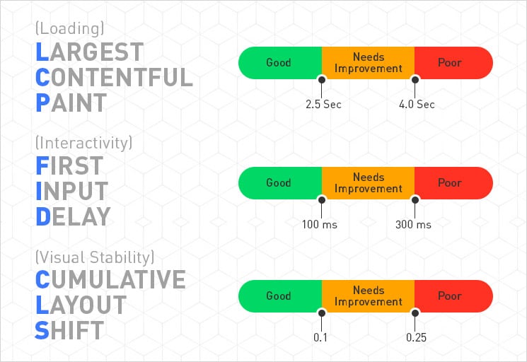
Core web vitals essentially consists of 3 key figures

web core vitals

Largest Contentful Paint (LCP):

LCP measures the rendering time of the largest element that is within the visible area of ​​the page. Google defines everything less than 2.5 seconds as a good value. Render times between 2.5 and 4 seconds are classified as in need of improvement according to Google’s Web Vital definition and everything above is considered to be poor value according to the company.

First Input Delay (FID):

FID measures the time that elapses between the first user activity and the response of the browser. What is meant, for example, is the delay that exists between the first click on a button or link and the action taken. Google regards all FID values ​​below 100 milliseconds as good. Values ​​between 100 and 300 milliseconds are considered to be in need of improvement and anything above that as bad.

Cumulative Layout Shift (CLS):

CLS serves as a metric for the visual stability of a website and measures how often page elements shift unexpectedly. This means, for example, asynchronously loaded page elements that suddenly change the layout of a text. But buttons, which suddenly appear completely different after being clicked, are also included, according to Google. CLS is calculated from two values ​​that are multiplied together. Google considers the first impact fraction, by which the company refers to the percentage of the viewport that the change affects.

If an element takes up half of the page before the change and then moves down 25 per cent, it affects 75 per cent of the page and the fraction of the impact is 0.75. This value is multiplied by fraction of the distance. This is known as the greater distance that moves an element. In the previous example, the value would be 0.25. The CLS would then be 0.1875.That could already be improved, because Google only considers values up to 0.1 to be good. All values from 0.25 are classified as bad.

Core web vitals: This is how you can test your web presence!

The Web Vitals key figures LCP, FID and CLS are currently being recorded by the Chrome User Experience Report. In the long term, however, they should also appear in PageSpeed Insights and the Search Console’s speed report. Currently, both tools only measure the FID. In addition, Google is working on a Chrome extension that will show you the web vital results of a visited website directly in the browser.

Google wants website operators to record Web Vitals key figures themselves using real visitor data as far as possible. For this purpose, Google has published an open source Web Vitals JavaScript library on GitHub. The code can, for example, be integrated into your own page in conjunction with the respective analytics provider, or it can also serve as a reference for your own recording solution for Web Vitals key figures.

If you have query regard to different tools and metrics to evaluate your websites, we are happy to assist you. If you are looking to improve your website’s usability, speed, user experience, explore our UI UX web designs services! We are also providing website revamp, website redesign, online store revamp, ecommerce website revamp services, for more information, please explore our website redesign services!

If you have any questions or would like to know more about how Skynet Technologies can help your business to reach one step ahead, Reach out us through below form & We'll get back to you soon!

Quality UX Web Design to Make your Website Visitors Happy!

By | Date posted: | Last updated: December 29, 2020
ux web design

The main aim of any “Quality UX Web Design” is to make their visitors happy & let them give a reason to coming back to brands and companies. What’s behind it, and how properly UX designers implement it?

The term user experience (UX) describes all aspects of a user’s experience when interacting with a product, service, environment, or facility. UX designers want to inspire people. Already clear. You want to design the interaction between technology and users in such a way that good experiences arise. Correct. But do you want to make people happy with your designs? The response is a resounding yes and no. Because anyone who is brooding over an information architecture just to lead the user to the buy now button as quickly as possible has not yet thought the matter through to the end. Can that be the point of UX? Rather not. This is supported by developments over the past hundred years: Although new technologies have greatly simplified people’s lives in many ways.

From usability to positive psychology

The question about the actual goal of UX designers is therefore justified. Most technologies still lack an explicit focus on increasing the wellbeing of the people who use them. In practice, many users equate experience with usability. In this sense, UX design should above all make the use of a product simple and understandable.

However, in order to make the user experience a moment of happiness, good usability is not enough. This is why UX has set itself apart from usability more and more in recent years. In this interpretation, the UX designers deal not only with usability, but also with the emotions of the users during the interaction. As a result, the user-centred design has increasingly changed to the approach of experience design. Positive emotions ensure that users are not only satisfied with the product, they also have fun and bond emotionally.

The Positive UX web design approach now goes one step further. It no longer just leads users to their goal as quickly as possible or generates short-term emotions. At the very beginning of the design process, quality UX design asks which fundamental positive experiences the use of a product should generate and how the product can promote the user. Only on this basis does the user experience develop. What may sound idealistic at first, is a thoroughly innovative design approach that can create added value for users and companies.

The basis for quality UX design is “positive psychology”: It deals with the question of what makes people happy and is based on the knowledge that happiness does not necessarily come from the fact that there is no unhappiness.

Two theories or models are particularly interesting for quality UX design. One comes from one of the masterminds of positive psychology, is called the Perma-Model. Accordingly, real well-being arises when several components are fulfilled in life: Positive emotions (P), commitment (E), relationships (R for “Relationships”), meaning (M for “Meaning”) and successes (A for “Achievements”).

The second – for UX design interesting – the approach of positive psychology. According to the study, the experience of flow promotes happiness in people. A person is in the flow to use and demonstrate skills and knowledge when faced with an appropriate challenge. In the flow, the person forgets the time, concentrates only on the current activity, and fades out everything around them.

Quality UX web design in practice

In practice, two types of quality design can be distinguished: On the one hand, explicit quality design refers to technologies whose main task is to promote human well-being. This includes mindfulness apps, for example. On the other hand, so-called active quality design integrates well-being as a conscious goal in the design process of everyday technologies that actually have a different primary function. This is exactly where quality UX design comes about, which companies need for sustainable success. Various quality design approaches are available for this. Above all, the methods can be integrated into the user research phase and the generation of ideas.

One method for quality UX design is experience interviews. In contrast to conventional user interviews, they do not focus on problems and challenges in using a product; instead, designers ask about positive experiences in a context in experience interviews. The users should therefore describe what makes them happy in certain situations and why. An example: In order to improve a project management tool as user experience, there were experience interviews that asked potential users about experiences in the context of work in general – i.e. independent of the tool. The result was the positive experience “Creating something together”. The provider of the project management tool finally implemented this knowledge in a function with which teams can jointly set their goals in writing and show their progress graphically. That helped the employees to structure clearly defined tasks in the team and created a pleasant working atmosphere through a transparent workflow. Without the experience interviews, the provider would probably not have come up with the idea of supporting the community experience in design. In addition, UX designers should also consider general human needs in their design.

The quality thing about it: The connection is scientifically sound, and designers can easily incorporate these needs into their designs. For example, in order to take into account autonomy – that is, the possibility of aligning one’s actions with one’s own goals and values – in the UX design, a “do not disturb” function on the smartphone or PC may be sufficient. In this way, users can decide for themselves when they want to receive messages, and when they do not want to be disturbed.

In order to integrate the topic of “competence” into UX design, users must be able to master challenges. For example, UX functions can provide feedback when users have completed certain steps: so-called progress steps or confirmation cards emphasize success and thus create a feeling of competence. We all know a UX function that fulfils the need for connectedness – or belonging: It’s the Like button. Through it, users express mutual appreciation and show their attachment to certain topics, opinions or products.

In addition to these three needs, science has identified many other needs that are important to human wellbeing. This includes significance, stimulation, security as well as popularity. For designers, it is worth taking a closer look at the needs of website visitors.

A framework for quality UX web design

Another approach for UX designers is the good design framework. It is supposed to help designers to enable flow states for their users. The framework contains three components: First, the users should experience positive emotions. Second, they should achieve their personal goals. And third, they should be able to act according to their values. If a product design supports all three experiences, the user blossoms during use and experiences flow.

Quality UX design does not require a new way of thinking, but a rethinking of UX design – the design goal is expanded to include the aspect of long-term well-being. Quality UX design methods can be integrated into the previous design process and thus initiate real, positive changes in the users’ lives.

With the right and quality UX design, for example, the running app can permanently motivate users to exercise so that they experience emotions not only during but also before and after the actual activity. The good experience is carried over from the interaction context into personal life and, in the best case, creates well-being and happiness. And: Happy users definitely have added value for companies. Be it through an emotional connection to the respective provider, an increased number of users, or stronger brand loyalty.

Conclusion

The point of UX design isn’t just about solving problems. Rather, it can be the starting point for promoting people’s potentials and abilities. This rethinking in UX design towards more positivity and the goal of long-term can offer real added value for users and companies. And it can shape a digital world that, with a new understanding of user-centered design, not only makes people more productive but also give their business a boost.

Do you need any help to improve your user experience of the website? We are here to help you out! If you are looking for UX/UI web design, online store design, ecommerce website design, Explore our website design services! We also provide website revamp service, online store redesign service, or ecommerce website redesign service, for more information, please explore our website redesign services!
If you have any questions or would like to know more about how Skynet Technologies can help your business to reach one step ahead, Reach out us through below form & We'll get back to you soon!